Showing posts with label Maps. Show all posts

Monday, August 11, 2014

Israel's Hasbara Machine Misfiring or Overhyped?

Israel expends a lot of effort and spends a lot of money on 'Hasbara', literally 'explaining', but understood by most to be a euphemism for 'propaganda'. Despite this, the recent conflict between Israel and Hamas has produced in a series of crude and seemingly carelessly designed graphics.
I first noticed this when the IDF published this aerial or satellite photo of a property where rockets were alleged to have come from.
Source: IDF's Facebook page. July 23, 2014

Strangely enough there are two overlapping property or lot outlines depicted here. I spent many of my school breaks working at my local municipality with aerial photography and I have quite a bit of experience with tracing building outlines or designating property outlines. I also know that hiding one or the other from this image is a quick task that takes less than a minute, even if one was unfamiliar with basic GIS (geographic information systems, a way of storing spatial data digitally) and mapping software. 

I figured this was nothing more than a slip-up until I remembered the maps from the IDF and Israel's Foreign Ministry showing the range of the various rockets employed by Hamas. These rockets have an estimated maximum range. To show this, for some reason the Israelis decided that they would use a circular outline. This is illogical because not every rocket will leave from the same location, so a rocket with a 30 km range will not be able to travel 30 km north into Israel if it is launched from the southern Gaza Strip.
Source: IDFblog.com
In GIS programs there is a function called "buffering" where a line is drawn at a specific distance from another line (in this case the Gaza-Israel border). This results in a line that is nor perfectly curved.
This is what the buffer function looks like. SOURCE: flatworldknowledge.com
A properly buffered map of the range of the various rockets used by Gaza-based militants looks like this (it is possible to do this in a 2D photo as well)
Source: NY Times
It is clear here that the range of the rockets is based upon the boundary of Gaza rather than a specific point. In reality it doesn't change anything, but it is still strange that such amateurish efforts would be accepted.

Buffering and property outlines are not the only mapping problems that the IDF has had. They've also published a few strange maps.

The first is a map of tunnels built by Hamas for the purposes of attacking Israel. For someone who is not as familiar with cartography this may not look like a bad map, but for someone from this background, the level of clutter, the amount of extraneous color and information, as well as the lack of a compass arrow or a proper legend is striking.

Source: IDF's Facebook page
The following tweet by the IDF's Spokesperson was probably the most surprising instance for me; it was so clearly flawed I am not sure how they approved it in the first place:

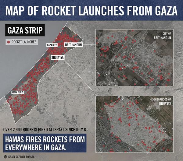
It doesn't take a Cartography or GIS major to notice that it appears as though a lot of the red dots on the left side of the larger image are coming from the Mediterranean Sea. Strangely enough, the IDF later corrected the image, shifting the dots, aligning the drawn western border with the ocean.


The IDF's recent hasbara efforts, especially related to maps and images appear crude and half-hearted. For a program that is considered by many to be slick and monolithic, it is producing some fairly low-quality work.

Tuesday, April 2, 2013

Early Islamic Cartography


I have been fascinated by maps for as long as I can remember. I would spend hours staring at maps as a child. No matter how dull or poorly-constructed they were, I was always interested. So when one of my undergraduate classes had a field trip scheduled to the University of Minnesota Map Library I was ecstatic. When we got to the library we had a short presentation. At one point my professor put a slide up on the screen with an image of an ancient map and asked us to identify it. I immediately shouted out "it is the Middle East!". My classmates were shocked at how I could so quickly identify what it was. One of the reasons why they all had trouble recognizing it was because the map was "upside-down" with South being at the top and North at the bottom. Turns out that this was a reproduction of a map that is approximately 1000 years old. Westerners almost always put North at the top of the map and think of North as "up". This has been the standard for centuries, so challenging this idea seems strange to many of us. Why should we do something differently after doing it the same way for so long?

This was not always the case. As early Christian maps show, East was often put at the top of maps because Jerusalem, the holiest site for this religion was supposed to be in the center of the world and also higher than Europe. These 'T-O' maps as they are called today, depict a circular world with an ocean around it. Inside the 'O' of the world ocean are 3 continents, Europe on the lower left, Asia on the top, and Africa on the lower right. Bodies of water like the Mediterranean in the center and an unidentified river or passage (Perhaps the Red Sea) make up the "T". Jerusalem was at the center where the waters intersected with the 'T'. As the linked examples show, these maps were not very spatially accurate, although as this example shows, they were close enough where it is not so much of a stretch.

Crude T-O Map
Stylized T-O Map


When the Western world began its descent following the collapse of the Roman Empire it left a void, physical and scientific. What may be surprising to some, is that it was the Islamic civilization which took up from where the West left off. For hundreds of years Islamic science ruled. Initially confined to a small space on the Arabian peninsula, the rapid expansion of Islam inspired multiculturalism as it came into contact with many different civilizations. One of the most important aspects of Islam is praying towards Mecca, which happens five times per day. When Islam was only on the Arabian Peninsula it was easy to tell which direction Mecca was because the physical distance was small. As Muslims moved further and further from Arabia it became much more difficult to be certain, so there was the necessity to always be able to orient oneself. Geographic knowledge was so important to them, that mapping "schools" were established in Baghdad by the Caliph Al Ma'mun. Initially the works produced here were based upon Hellenic works such as Ptolemy's Geographia, but over time they developed their own style through the Al-Balkhi and Al-Idrisi mapping schools. 

Following are some examples of early Islamic maps:
Al-Idrisi World Map (South is up)

Ibn al-Wardi Atlas (North is up)
Stylized Persian Gulf by unknown. East is up but I believe this was turned and South originally was up

Unknown
Al-Istakhri of the South Caucasus. Mountains are straight, I am unsure why this is different from others


They are distinct for a few reasons. First unlike many of the early Medieval European maps, there are no extraneous "details" such as fantastical sea creatures or angels. It is not exactly clear why this is the case, but a logical answer would be that it has something to do with the Islamic ban on creating representations of figures. The Ottomans did not have a problem with putting figures in their art so it is apparently not out of the question for all Muslims, but it does seem to make some sense that early Islamic works would be devoid of representations of humans or other animate objects. Secondly, the lines are more curved than in Western maps. There are no sharp angles, even the mountains are rounded. This again may be inspired by Islam or the Arabic script in some way, but the connection is unclear. Third, South is almost always at the top of the map. This again is perplexing as Mecca is put neither as the center or the top of the map. So why would this be the case? Mecca was clearly the most important place in Islamic civilization, why not put it at the top or at least at the center of the map? Occasionally it is towards the center of the map, but it is never emphasized as such like the Western maps did with Jerusalem. The Tabula Rogeriana by Al-Idrisi, a Spanish-Moroccan Muslim employed by Roger II of Sicily, shows a more advanced and improved version of most of the Islamic maps, yet it clearly was inspired by the earlier cartographers. It was made for a Western ruler, yet had all of the characteristics of an Islamic map. (here is the Saudi Arabia portion of the Tabula Rogeriana reoriented with North as up)

For several centuries Islamic science was incredibly important, but despite being far more advanced than the contemporary works of the West, the geographic knowledge of the Islamic civilization was discarded by Western scientists. Why was this the case? Why would superior works be ignored? Why would they regress from the emphasis on geographic accuracy and start adding extraneous details? Why would theTabula Rogeriana's groundbreaking work be ignored? Islamic maps had clearly made their way into Europe and as the example of Roger II commissioning the work, one would think there would be at least some interest in the work of the Islamic cartographers.

There are no comprehensive studies of this subject, and even some books wrongly claim that Islamic maps exclusively are oriented (yes this is a purposeful use of 'orient' as it also means 'East'), with East as up, despite there being virtually no evidence supporting this (there are a few maps like this, but the majority of the surviving map copies have South at the top). I find the Islamic cartographic practices to be fascinating. Why this subject has been ignored is beyond me.