I first noticed this when the IDF published this aerial or satellite photo of a property where rockets were alleged to have come from.
 |
| Source: IDF's Facebook page. July 23, 2014 |
Strangely enough there are two overlapping property or lot outlines depicted here. I spent many of my school breaks working at my local municipality with aerial photography and I have quite a bit of experience with tracing building outlines or designating property outlines. I also know that hiding one or the other from this image is a quick task that takes less than a minute, even if one was unfamiliar with basic GIS (geographic information systems, a way of storing spatial data digitally) and mapping software.
I figured this was nothing more than a slip-up until I remembered the maps from the IDF and Israel's Foreign Ministry showing the range of the various rockets employed by Hamas. These rockets have an estimated maximum range. To show this, for some reason the Israelis decided that they would use a circular outline. This is illogical because not every rocket will leave from the same location, so a rocket with a 30 km range will not be able to travel 30 km north into Israel if it is launched from the southern Gaza Strip.
 |
| Source: IDFblog.com |
In GIS programs there is a function called "buffering" where a line is drawn at a specific distance from another line (in this case the Gaza-Israel border). This results in a line that is nor perfectly curved.
 |
| This is what the buffer function looks like. SOURCE: flatworldknowledge.com |
A properly buffered map of the range of the various rockets used by Gaza-based militants looks like this (it is possible to do this in a 2D photo as well)
 |
| Source: NY Times |
It is clear here that the range of the rockets is based upon the boundary of Gaza rather than a specific point. In reality it doesn't change anything, but it is still strange that such amateurish efforts would be accepted.
Buffering and property outlines are not the only mapping problems that the IDF has had. They've also published a few strange maps.
The first is a map of tunnels built by Hamas for the purposes of attacking Israel. For someone who is not as familiar with cartography this may not look like a bad map, but for someone from this background, the level of clutter, the amount of extraneous color and information, as well as the lack of a compass arrow or a proper legend is striking.
 |
| Source: IDF's Facebook page |
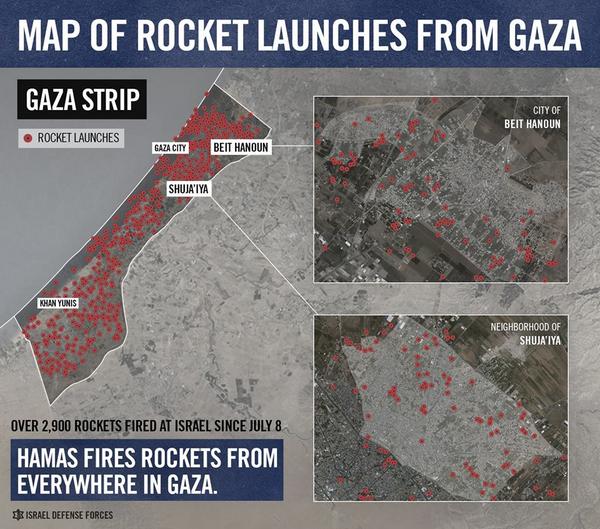
The following tweet by the IDF's Spokesperson was probably the most surprising instance for me; it was so clearly flawed I am not sure how they approved it in the first place:
As this map shows, Hamas fired 3,356 rockets at Israel from everywhere in Gaza since July 8th. pic.twitter.com/ZvPzwwKcNO
— IDF (@IDFSpokesperson) August 7, 2014
It doesn't take a Cartography or GIS major to notice that it appears as though a lot of the red dots on the left side of the larger image are coming from the Mediterranean Sea. Strangely enough, the IDF later corrected the image, shifting the dots, aligning the drawn western border with the ocean.
The IDF's recent hasbara efforts, especially related to maps and images appear crude and half-hearted. For a program that is considered by many to be slick and monolithic, it is producing some fairly low-quality work.


No comments:
Post a Comment